


Embrace 不孤独岛
为重要时刻腾出空间
 Global site

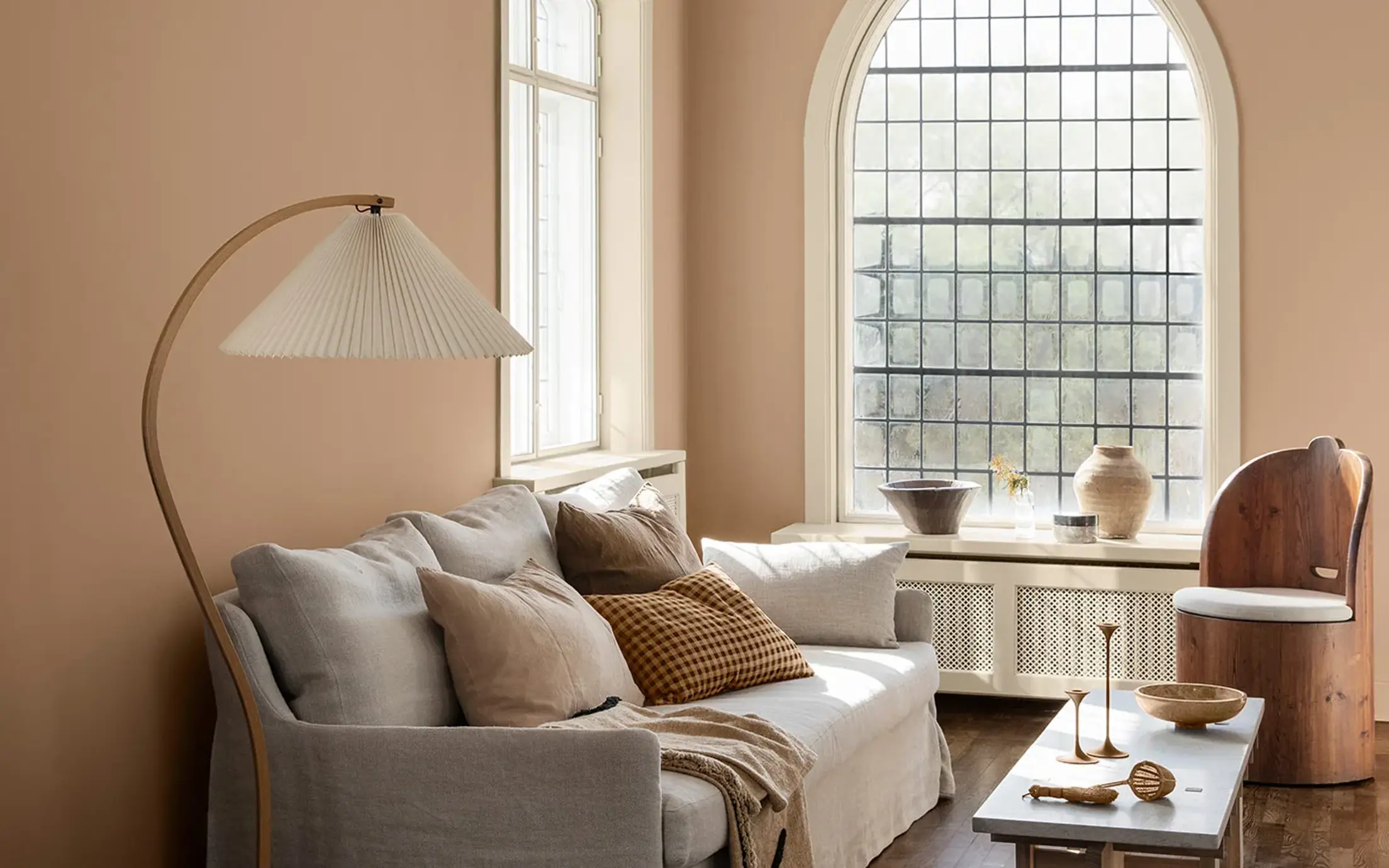
2022年,佐敦推出了最新的流行色——TOGETHER期遇,28个流行色可以轻松地搭配出无数种家居色彩方案。60年来,佐敦专注于色彩趋势研究,是家居行业的色彩大师,为您打造灵动与美的室内装修风格。

“人类是社会性动物。我们在与他人的沟通中茁壮成长,与朋友和家人共度的时光充实了我们,有益身心健康。与人共处确实可以帮助我们活得更加长久和幸福。
对于我们来说,从来没有像此刻这般需要重建人与人之间联系。放肆的谈论一切感兴趣的事情,又或相顾一笑,心有灵犀。”
Lisbeth Larsen, Global Colour Manager at Jotun
为重要时刻腾出空间

大胆尝试,自由创造

为反思、恢复、重新联系提供足够的空间
1875
senseBeige, a color of neutrality, is perceived as practical and orderly. It complements other earthy colours by providing a subtle balance.
1303
observeA yellow-beige tone. This is a yellowish beige tone that will come across as far more golden than traditional beige tones. It fits in somewhere between beige and yellow.
0280
caravanA yellow-brown ochre tone. This is an old favourite from Jotun’s archives, and by way of comparison with something more familiar, we think LADY Caravan is a lighter version of 10683 Cashmere, whilst being a little redder and warmer than 10961 Raw Canvas.
1909
chalk ochreA warm tone of ochre. This is a warm, subdued and modern ochre tone. It almost feels like lime, with its rustic and genuine appearance.
11130
shadeA warm grey-beige tone. This is a lovely, warm tone, something between grey and brown.
1876
wild earlBeige, a color of neutrality, is perceived as practical and orderly. It complements other earthy colours providing subtle balance.
12179
embraceA warm terracotta colour. An incredibly lovely, happy terracotta tone that encompasses the room. The perfect mix of pink and orange, bringing a feeling of positivity and warmth into the room.
1259
rustyA burnt, reddish-orange tone. LADY Rusty is a rustic terracotta tone able to bring joy and an earthy, natural atmosphere.
5516
iron blueA coarse blue-grey tone. This is an outstanding blue tone with a greyish expression, giving it a slightly coarse and industrial expression. It’s great on its own, but also makes an exciting contrast to a number of other hues.
7236
jazz whiteWhite, a colour of purity, suggests goodness and innocence. Its elusive nature provides a sense of serenity and the essence of perfection.
6383
imagineA bright, turquoise tone. This is a stunning turquoise tone, which is relatively pure and bright in its appearance.
6384
wishA bright, turquoise tone. 6384 Wish is a happy turquoise colour falling right between 6383 Imagine and 6084 Sea Emerald.
6084
sea emeraldTeal, a beautiful mix of blues and greens, takes the best qualities of each colour. It is versatile, and can be either striking or soothing depending on its application.
8565
hopeA lovely, bright green tone that can be described as springlike, lush and sharp. It’s actually a green tone that is much brighter than the subdued green tones we’ve seen in recent years.
0125
palm leafGreen, a colour of life, represents freshness and security. While it creates a restful atmosphere, it also possesses the intense power of nature.
20186
lavender touchA dusty tone of lavender. This is a greyish lavender tone, and a little cooler in its expression. Lavender is a key trend this season, and Lavender Touch is no exception.
10235
summer sunA lively yellow tone. This is a bright yellow tone able to fill the room with sunshine and positivity. Bringing yellow tones into the interior can feel like a shot of vitamins!
3377
slate lavenderA subdued purple nuance. The colour is greyish and a bit cool in appearance. Works well with cool grey nuances such as 9911 Platinum and 9930 Jazz Grey, but is also nice with warmer grey nuances such as 1032 Iron Grey, 1973 Objective, 1269 Dawn, 12077 Sheer Grey or 12078 Comfort Grey. Some people appreciate the combination lavender and green, and 7628 Treasure and 7629 Antique Green are nice alternatives.
1376
mistA warm greyish white
12180
presentA subdued, greige tone. This is a reddish subdued tone, able to bring warmth and softness to the room.
12181
soft comfortA warm grey-beige tone. This is a lovely soft subdued tone, able to combine the best from the grey and the brown.
12182
gentle whisperA light, greige tone. Gentle Whisper is a mellow, greige colour in which hints of beige and grey can be clearly seen. Undertones become clearer in lighter tones such as this.
20185
friendly pinkA dusty pink nuance. Kind and soothing.
20184
thoughtfulA rose-tinted earth tone. Caring and calming.
2011
antique brassA happy, peach pink tone. A lovely, positive and elegant peach pink tone. It can bring out the best in a subdued palette, or create its own atmosphere all on its own.
2040
light graniteA golden, pink tone. This is a livelier version of 10580 Soft Skin, but can also be described as lighter than 2024 Senses and more greyish than 2782 Deco Pink.
8281
pale lindenGrey is perceived as long-lasting and classic. It's an ideal background colour, and yet still carries authority. Grey also works well with flashy or colourful décor.
佐敦装饰涂料深受世界多国客户的喜爱。在下方列表中选择您所在的国家/地区,了解佐敦装饰涂料是否在当地有售。

正如与他人共处一室可以激发灵感、使人振奋一样,颜色也拥有一种能力,使人平静或者触发热情,理清思绪或者激发创造力。在佐敦,我们为周围的色调如何塑造日常生活而着迷。
今年,佐敦创建的颜色主题旨在分别反映和强化我们个人身份和生活方式的不同方面,但它们都根植于人类与他人共享时间和空间的普遍需求。 毕竟,我们注定要在一起。

打开手册,了解2022年流行色。

Jotun's new colour collection for the 2025 season, Nuances, celebrates the impact of subtle shades.

From our clothes to our homes, the colours that we surround ourselves with are a reflection of who we are and how we want to feel. In tribute to the art and science of colour, Jotun presents 23 colours for 2024.

2023 家话合集精选了一系列富有表现力、充满希望的色彩,旨在激发我们家居装饰的创意表达。

佐敦Rediscover复兴合集包含我们从色彩库中精心挑选出的一系列朴实、永恒而简约的色调。
佐敦所有的颜色均采用专为佐敦产品设计的独特配方开发,只有使用佐敦的产品和颜料才能保证正确的显色效果。 请注意基材、光泽、照明条件和其他产品饰面可能会影响颜色呈现。 由于屏幕设置和操作系统的差异,屏幕上显示的颜色可能与您想要的结果不完全相同。 屏显颜色仅供参考。
A video is being shown
An image is being displayed
A brochure is being displayed